New Brand Launched for Youth Insearch

On
Storytelling is at the heart of Youth Insearch and utilising young people’s extensive experience and a no-judgement approach to deeply understand and support youths, helps us to create a safe space for young people to heal and thrive.
We set out to create a new visual branding which captures this love and expertise, whilst appealing to youths and instantly portraying a sense of trust.
The existing brand had been identified as being a little too corporate and ‘stiff’ and our stakeholders expressed that it would benefit from a little more energy to truly portray and showcase the amazing work that our foundation does.
Guided by a committee of youth Leaders and staff, we explored the main logo, heart icon, the use of a shortened ‘YI’ logo, and our colour palette – the result of which is now displayed in our 20.
Our brand refresh journey has just begun, and throughout 2022 we hope to establish an iconic and recognisable brand that young people can access, and which extends throughout the social services sector.
A Human Touch
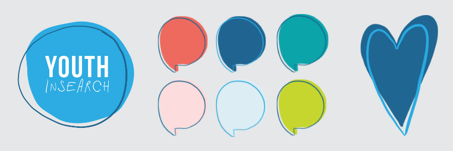
Using a combination of bold letting with a softer, more fluid hand-written font to give a nod to the ‘human’ importance and tactile nature of the brand. The hand-drawn elements can play into icons, the heart shape and any other design elements that will help to lift the brand.
This theme is energetic, has a youthful spirit and has a true sense of storytelling.
Colour Palette
Using the core ‘YI blue’ as a focus point, this colour palette is happy, caring, and inclusive, whilst still having energy and capturing a youthful vibe.
|
BLUE represents: Trust, Stability, Security PINK represents: Love, Compassion, Caring GREEN represents: Balance, Safety, Growth |
 |
Design Pathway
The new logo design uses bold hand-drawn lettering to show the power of the transformational work carried out at YI.
Using a ‘human’ handwriting to help encompass a youthful spirit. Having the font combination this way round and mixing with the drawn circle, helps give a sense of ‘being found’… as if the viewer has circled the word ‘youth’ themselves on their search for help and guidance.
Combined with softer hand drawn elements such as the heart, circles, and speech bubbles to help soften and portray an element of inclusion and trust within the brand.
The simplicity of this logo allows for a little more creative freedom with other hand drawn elements that could be used as the visual brands evolves.
